
This the visual identity I designed for the legendary race track in Zandvoort on the Dutch coast. Commissioned by and in coopperation with Being There, we developed a style that was modern and dynamic whilst at the same time spark the memory of the rich history of the circuit.
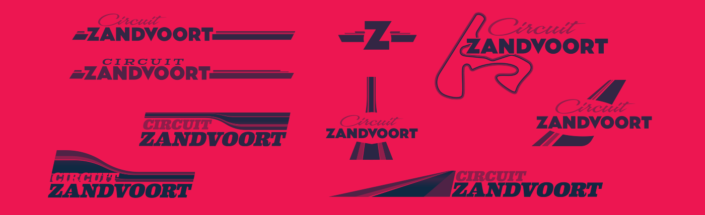
Early style and colour explorations
THE BRIEF
The initial request was to show the heritage of the circuit. The history, as Holland's main big circuit. So the early sketches explored that retro style, shape and colour seen in the racing and automotive world of decades ago.
We quickly found out this was falling short of the mark. This brand after all had to be a modernization as well as showing that heritage. However, during this initial exploratory process we got interested in striping and how it could convey speed, power, was a typical racing esthetic element and could also work as a visual metaphor for the track and other features of Circuit Zandvoort.
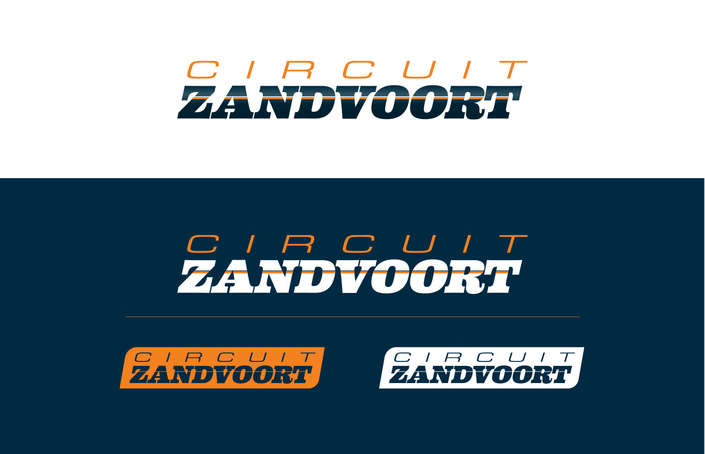
VISUAL CONCEPT
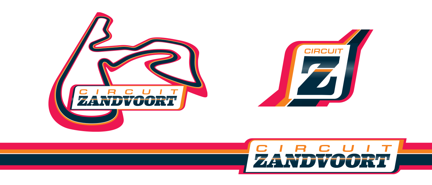
Based on this race striping idea a set of logo iterations for both primary and secondary use were developed. As well the rules of colour usage.
The colours represent the the tarmac and rubber in the dark blue. The orange hints at the Dutch heritage (fun fact: the circuit's owner is actual royalty) but also the beach that the main straight of the track runs parallel to. And the magenta red adds the excitement of a day at the races.
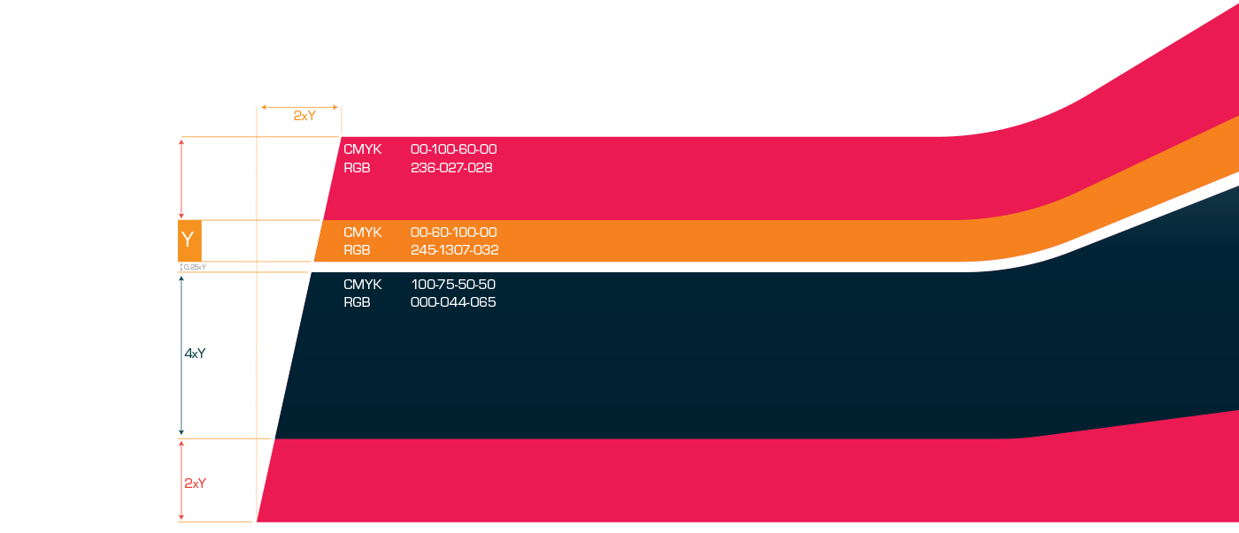
Colour balance and values

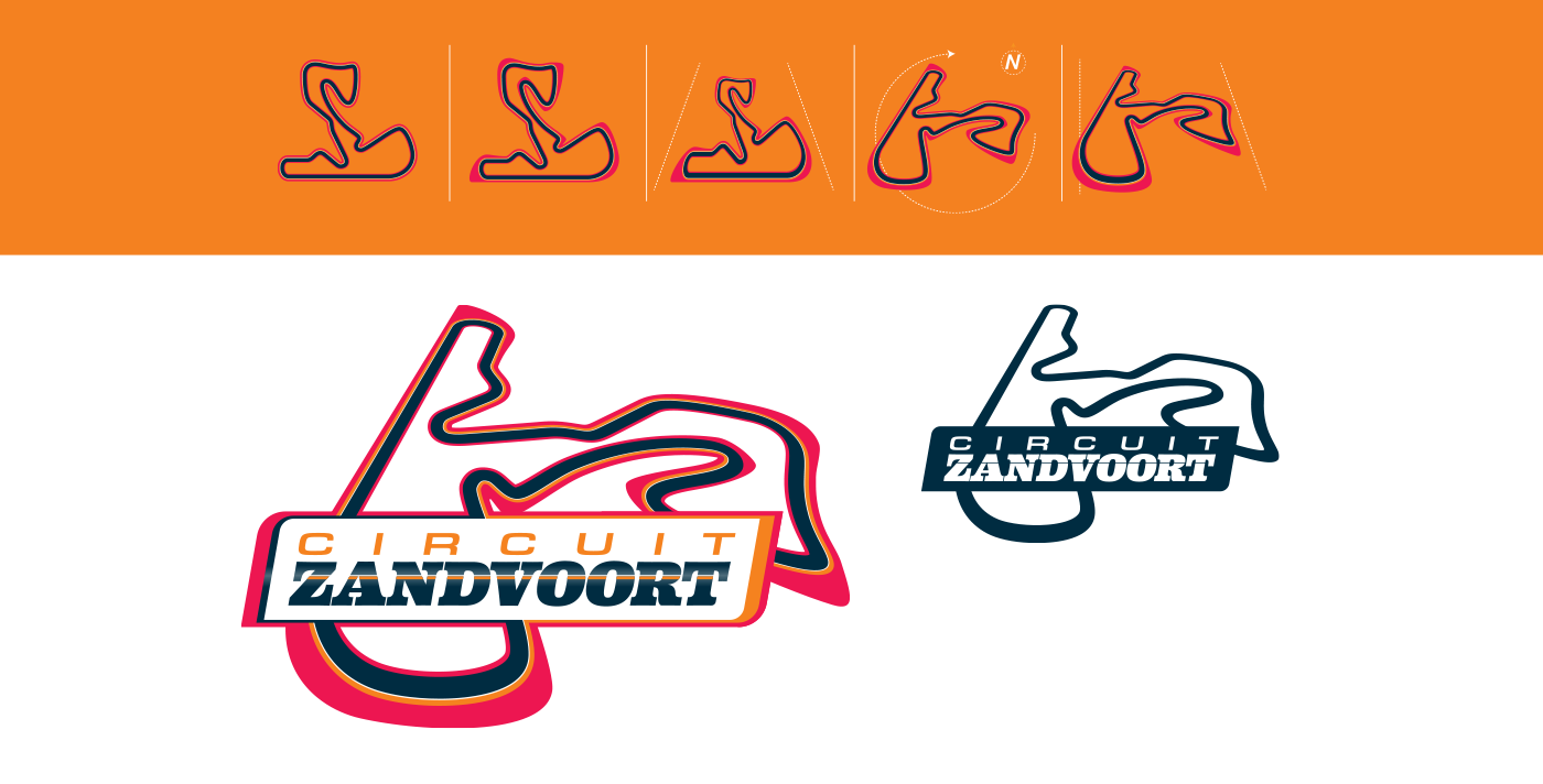
THE CIRCUIT
As a special request from the client a special version of the lock-up was made combining the logo with the lay-out of the race track. This is (as I learned) a common occurrence in the racing world, where car and racing enthusiasts like to show the track they've been to or even raced on.
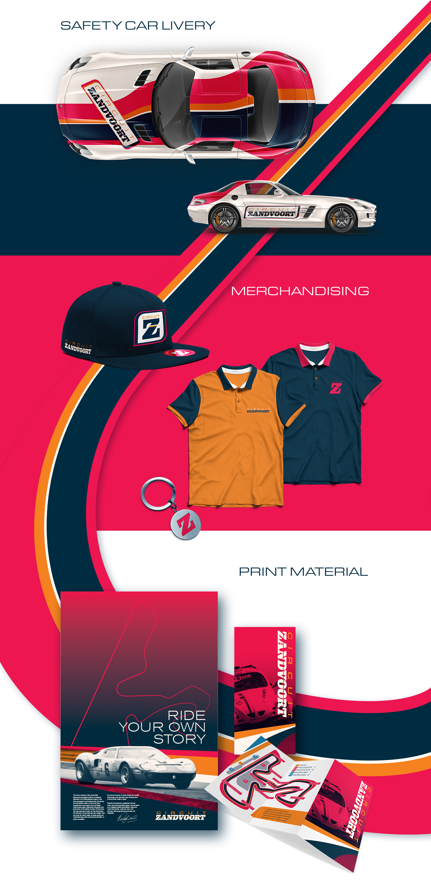
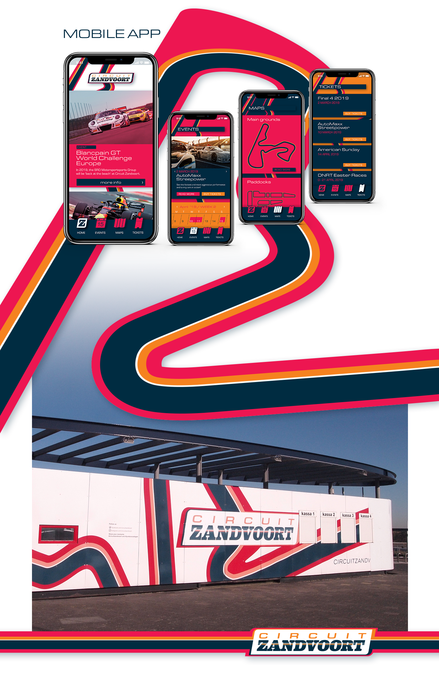
IMPLEMENTATION
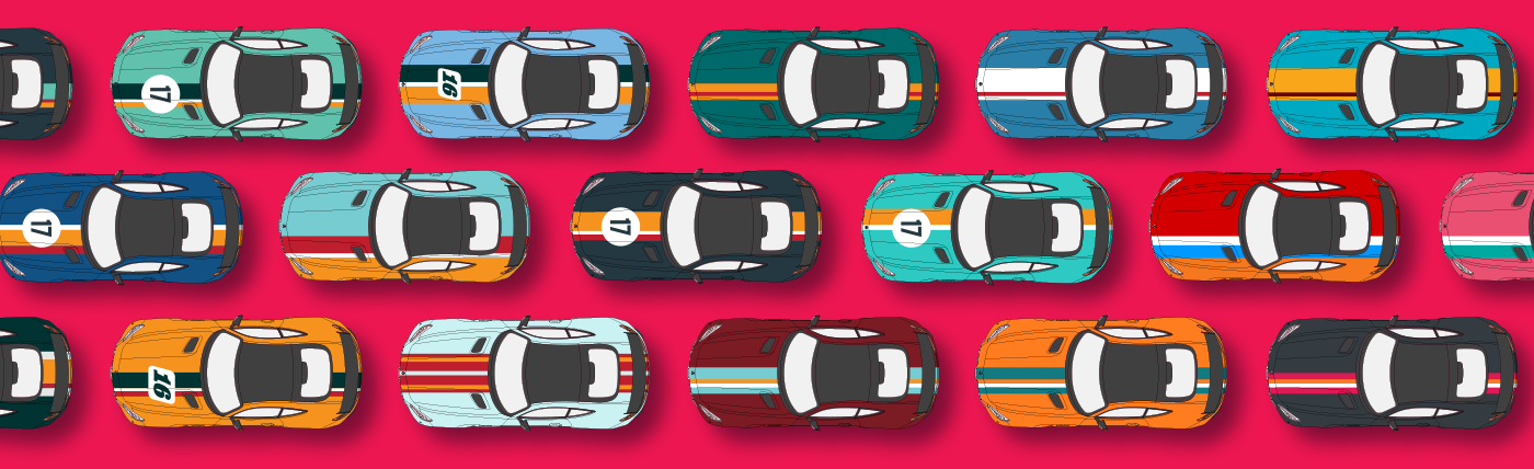
When most of the brand elements were in place, the real fun started. We designed a whole bunch of potential applications and merchandise. Not all of these saw the actual light of day, but it was a blast designing it all.